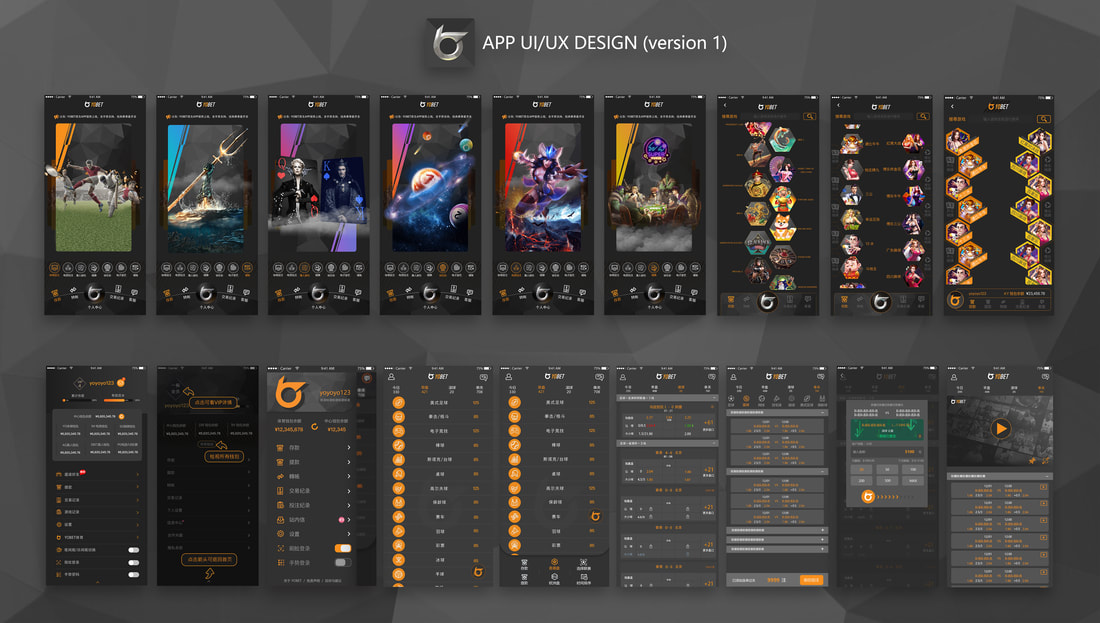
YOBET APP 01- UI/UX DESIGN
Elevating Gaming Experiences with Cutting-Edge UI/UX and Seamless User Interactions
- CLIENT: YOBET-ONLINE GAME COMPANY (CHINA)
- PLATFORM: IOS & Android mobile & html 5
- TARGET USER: ONLINE CASINO & SPORTS BETTING CHINESE USERS IN ASIA
■OVERVIEW:
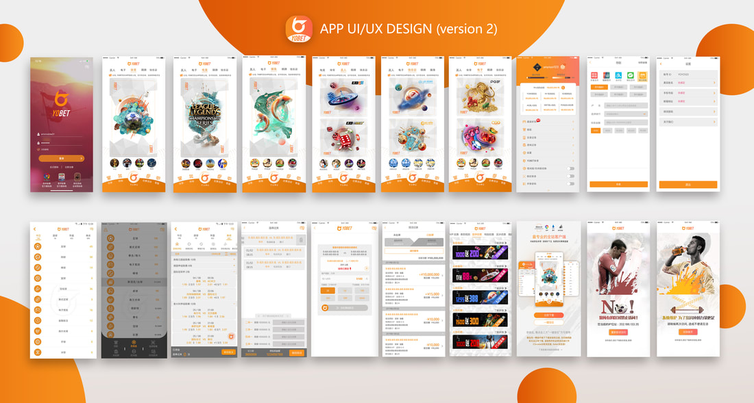
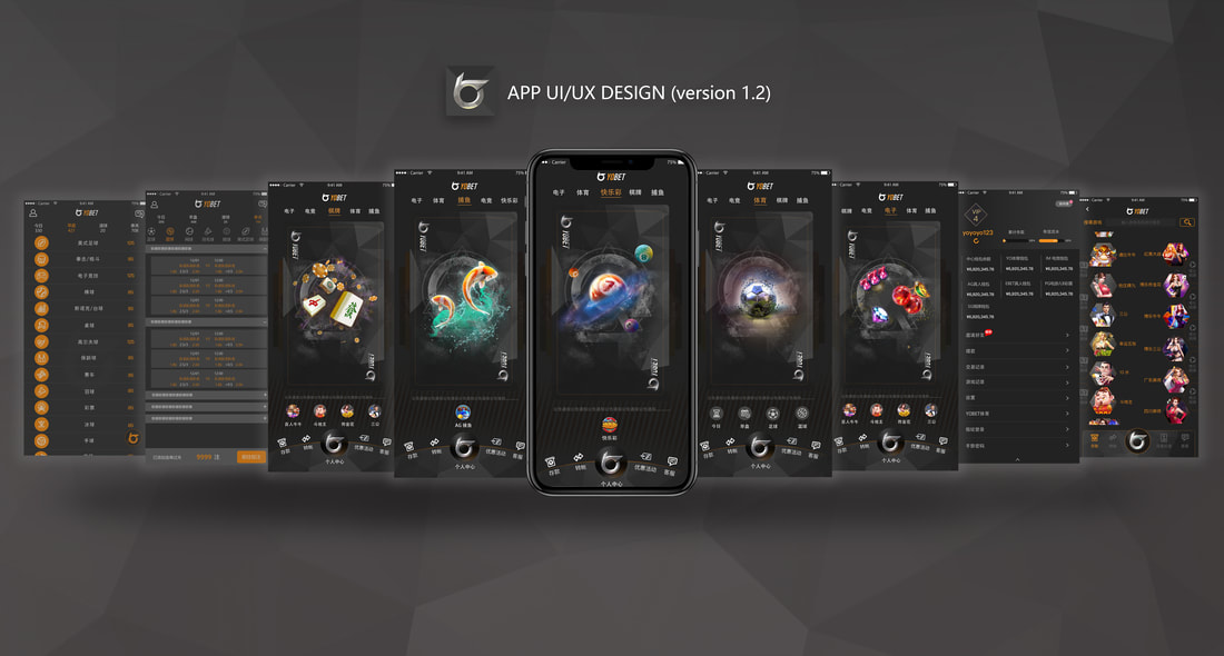
In the bustling heart of Kuala Lumpur, a dynamic team of 50 individuals embarked on a mission to revolutionize the online gaming industry. YOBET, a visionary startup, set out to offer a cutting-edge suite of online gaming, casino, and sports betting services tailored specifically for Chinese gaming enthusiasts. Over the course of a transformative year, our dedicated UI/UX design team crafted and refined three distinct versions of the YOBET website and app. From a blank canvas to a fully-fledged platform, we launched YOBET to over thousands users in Asia, persistently enhancing the user experience and visual allure with every iteration.
■CHALLENGE & SOLUTION:
Our journey was fraught with formidable challenges. In a competitive landscape dominated by established giants, we needed to carve out a unique identity that would captivate users and inspire loyalty. The intricate web of sports betting statistics presented another hurdle, demanding clarity and ease of navigation. Moreover, we faced the task of creating an environment where users could comfortably engage for extended periods, whether they were placing bets or enjoying games.
To surmount these challenges, we embarked on an extensive exploration of color schemes, seeking a brand identity that was both refreshing and distinctive. We meticulously tested numerous fonts and layouts, prioritizing information readability and achieving aesthetic harmony. Our breakthrough came with the introduction of dual color modes—dark night and daylight--offering users the flexibility to choose their preferred reading environment. This innovative approach not only enhanced comfort but also set YOBET apart from the competitors, delivering an exhilarating and user-friendly experience.
Challenge 01
How to make a more stunning app than other competitors to capture users' eyes
Challenge 02
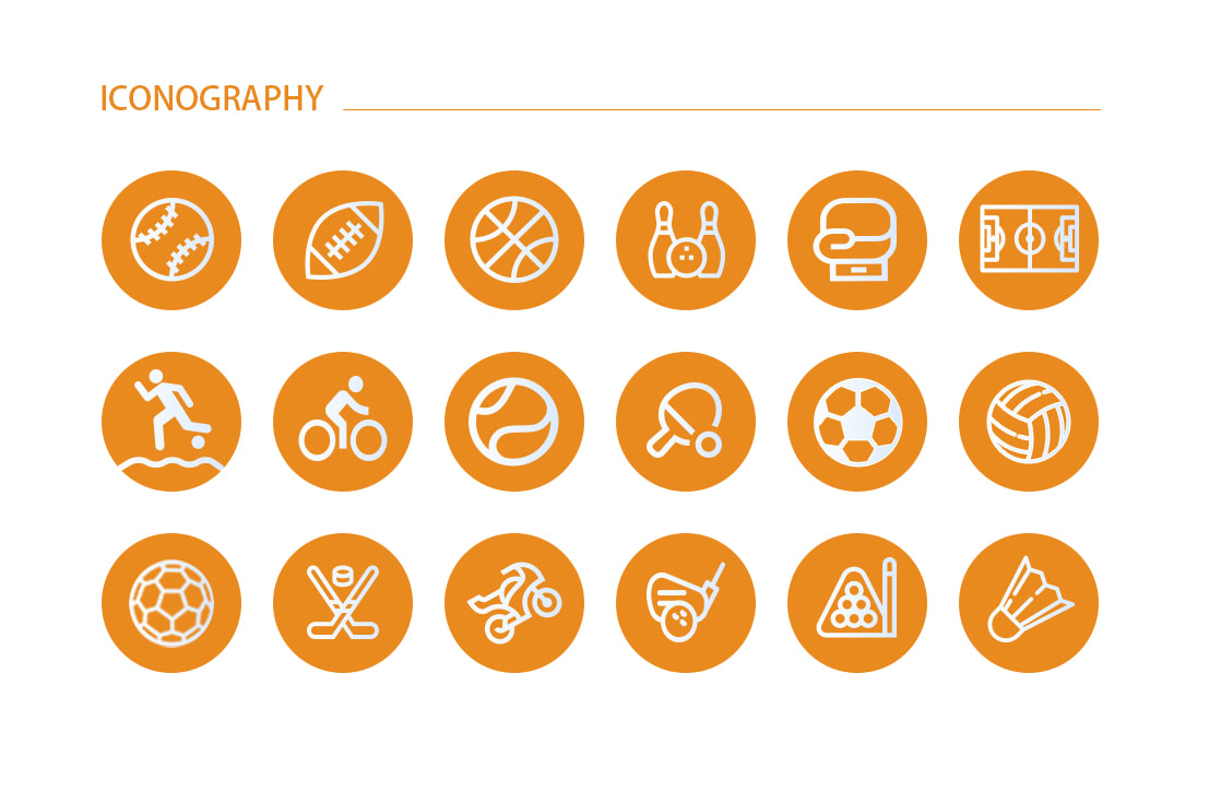
How to prioritize those complicated sport game betting statistics
Challenge 03
How to keep the users reading comfortably for a long time and don't feel tired
How to make a more stunning app than other competitors to capture users' eyes
Challenge 02
How to prioritize those complicated sport game betting statistics
Challenge 03
How to keep the users reading comfortably for a long time and don't feel tired
Our Solution
We made an innovation design which is two kinds of color modes( dark night color version and day light version)
to let users freely switch their favorite mode during playing games to give a more comfortable reading experience.
At the same time, we still put efforts to achieve the aesthetics perfection.
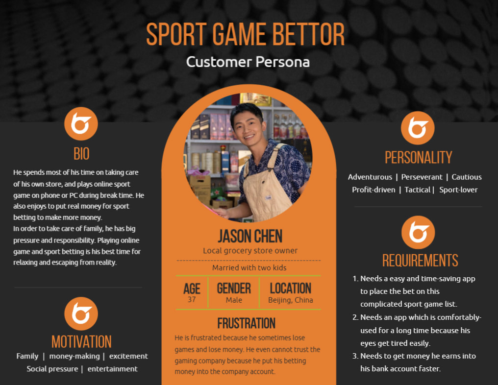
▲User Persona Building
Although we are a startup company, but our market manager and project manager who are experienced with this sport gaming and online casino industry. They leads us to do user research and competitor's product research. We build up a user persona which is the middle class Chinese sport lover, especially with some established career. They have some time and money to pursue more entertainment and make more money. Their key motivation for using our product are social pressure with money-making and family.
Although we are a startup company, but our market manager and project manager who are experienced with this sport gaming and online casino industry. They leads us to do user research and competitor's product research. We build up a user persona which is the middle class Chinese sport lover, especially with some established career. They have some time and money to pursue more entertainment and make more money. Their key motivation for using our product are social pressure with money-making and family.
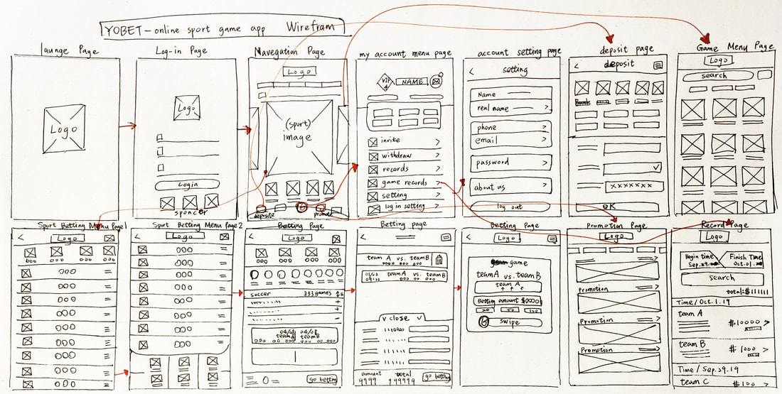
▲Visualization process with sketch wireframes
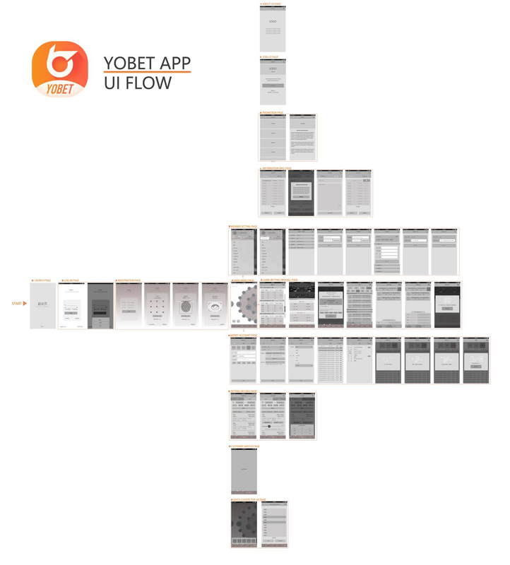
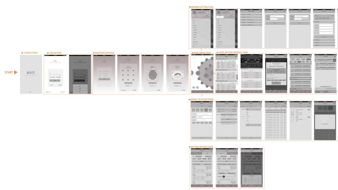
▲Design beginning process : APP Wireframe
|
|
|
|
|
|
▲The color plan experiment stage
We tried a lot of versions of fonts, layouts to prioritize information reading sequence, and also achieve the aesthetics perfection. There are a lot of score numbers and sport teams information to show. It also took a lot of effort to try different color matching and layout compositions for reading order of lots of information.
We tried a lot of versions of fonts, layouts to prioritize information reading sequence, and also achieve the aesthetics perfection. There are a lot of score numbers and sport teams information to show. It also took a lot of effort to try different color matching and layout compositions for reading order of lots of information.
|
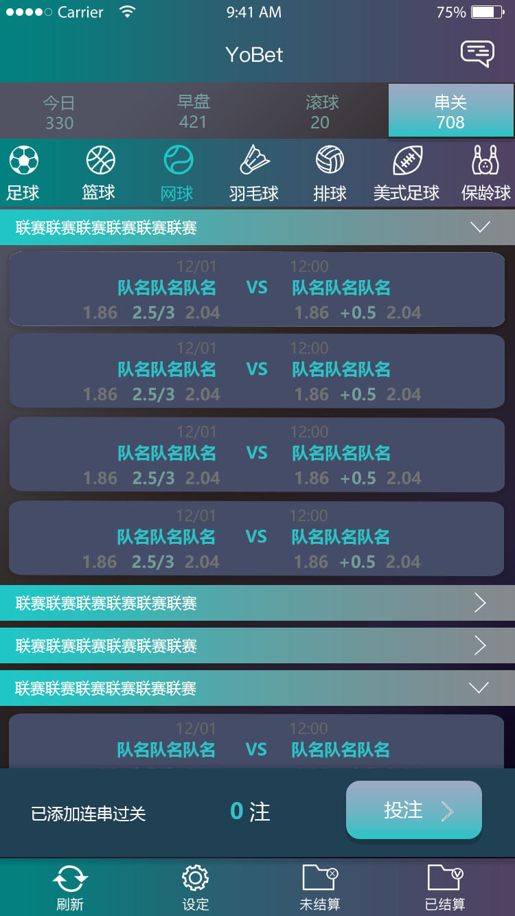
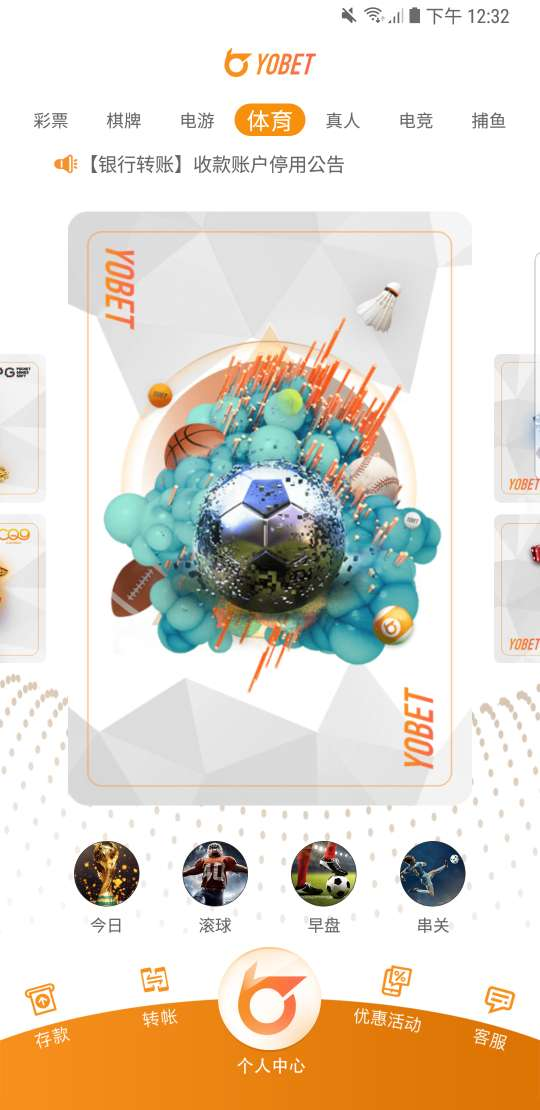
▲The main sports menu selection pages
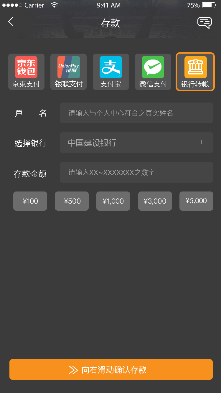
▲The deposit transaction pages
|
▲The main sports menu selection pages
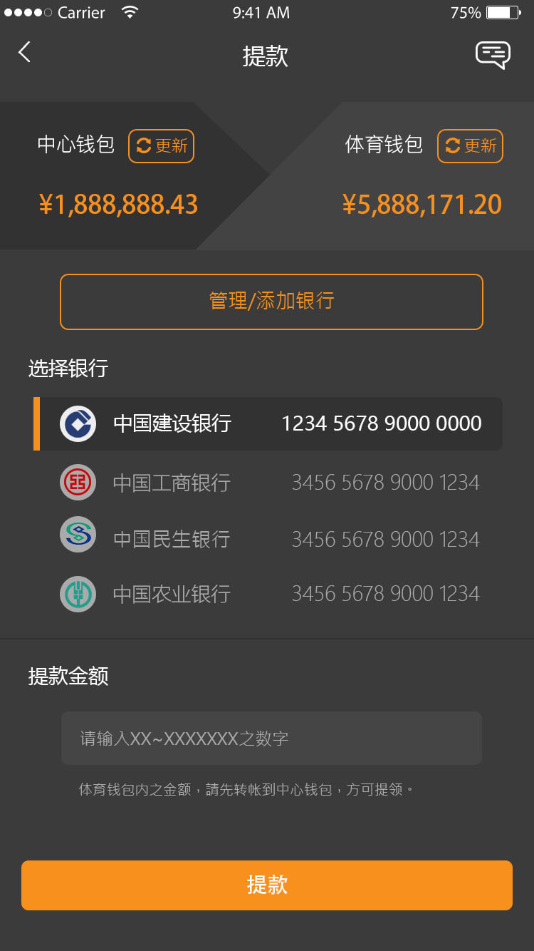
▲The withdraw transaction pages
|
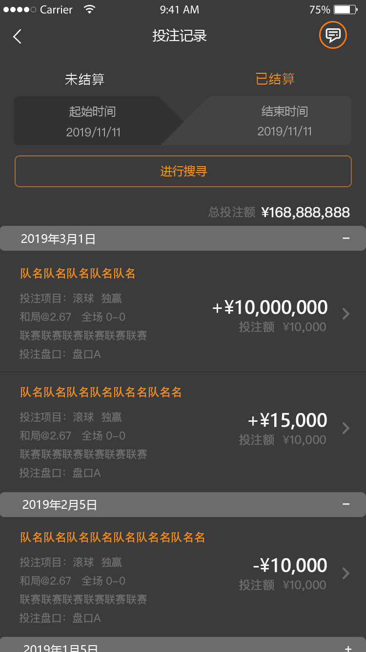
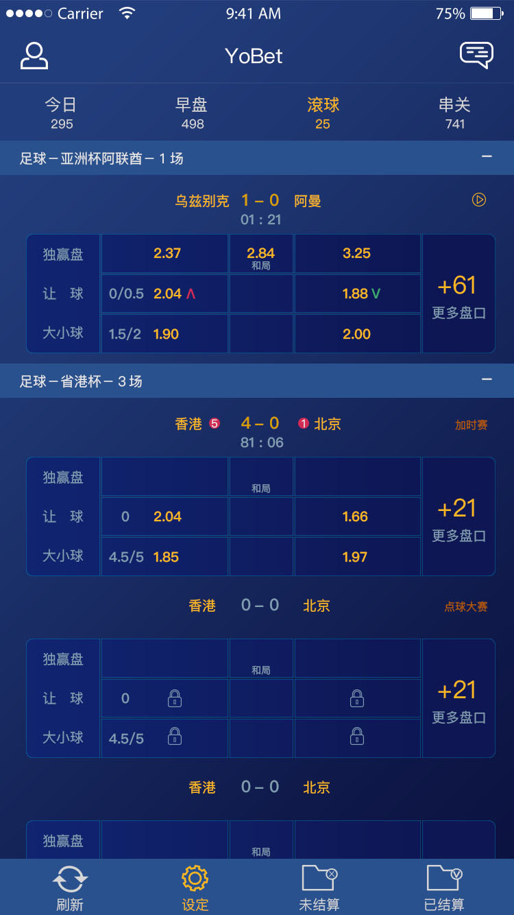
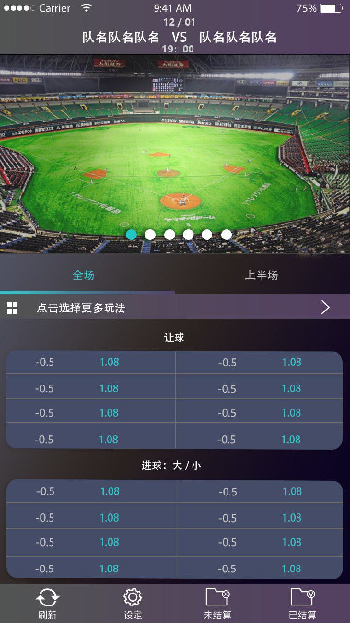
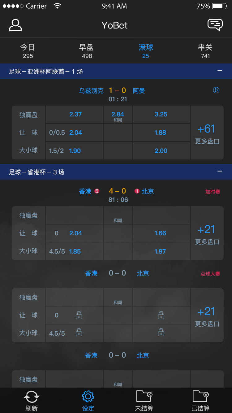
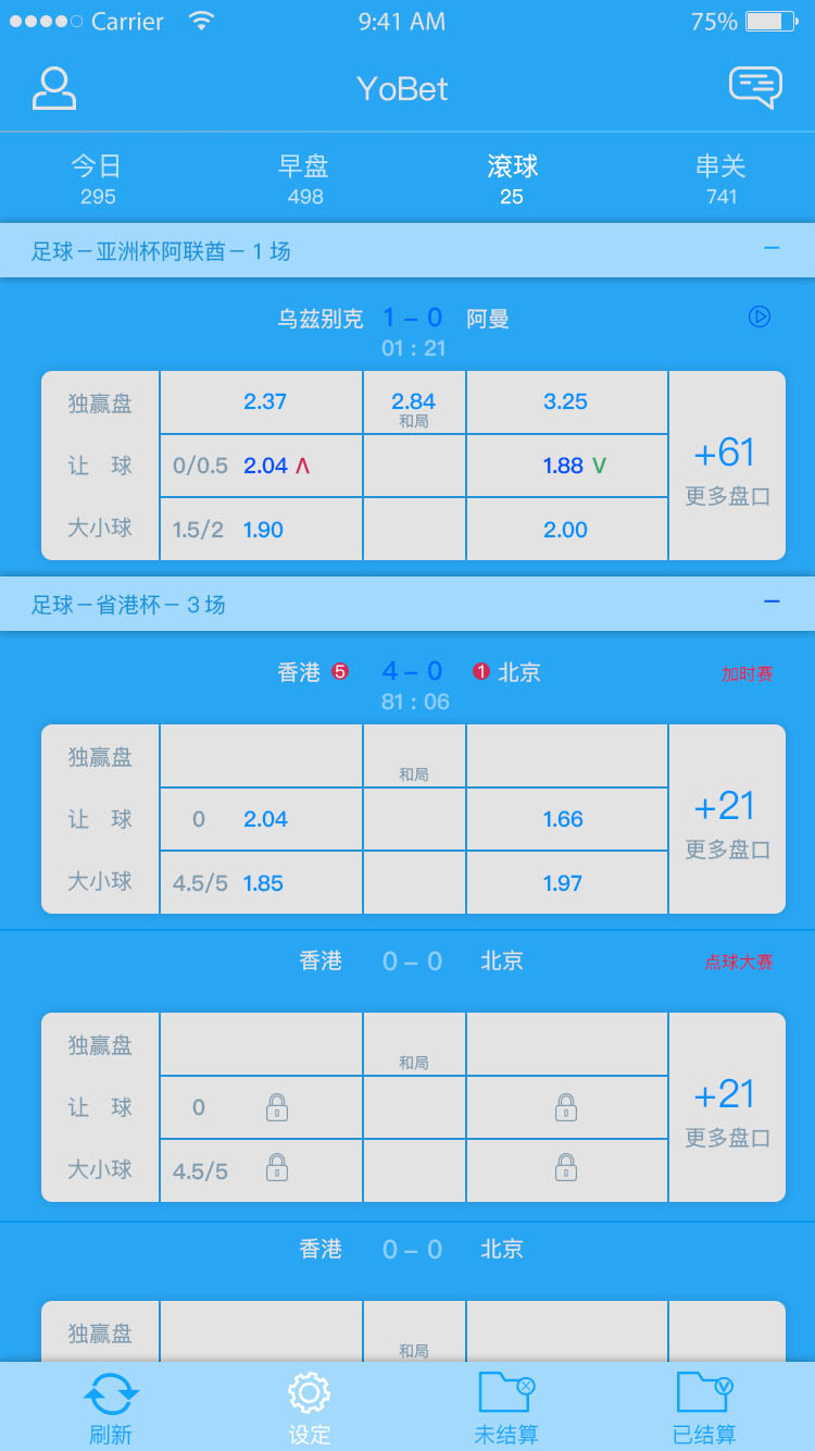
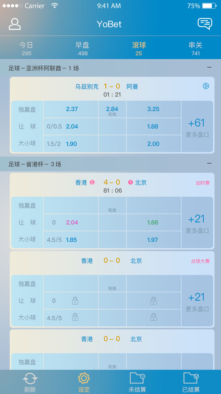
▲The sports betting pages
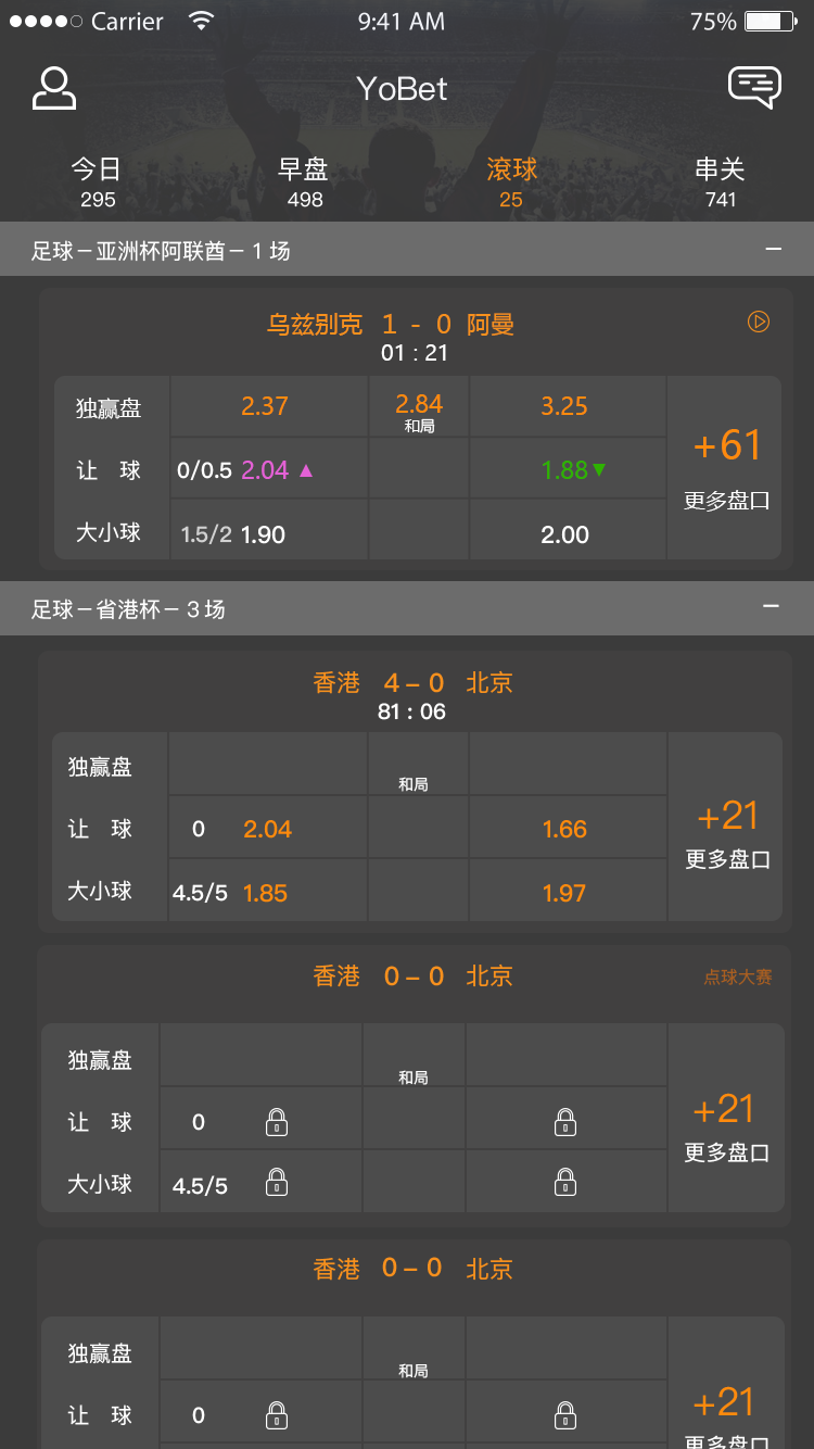
▲The sports betting pages
|
|
|
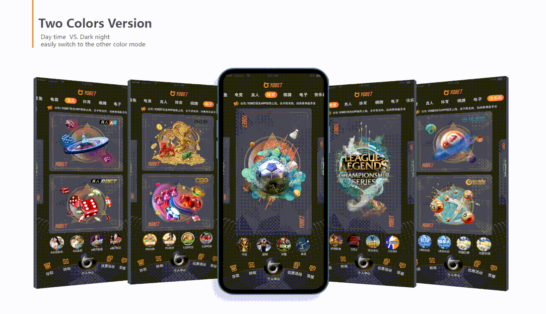
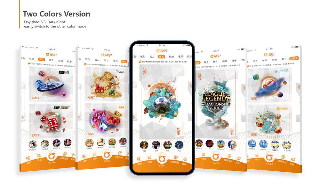
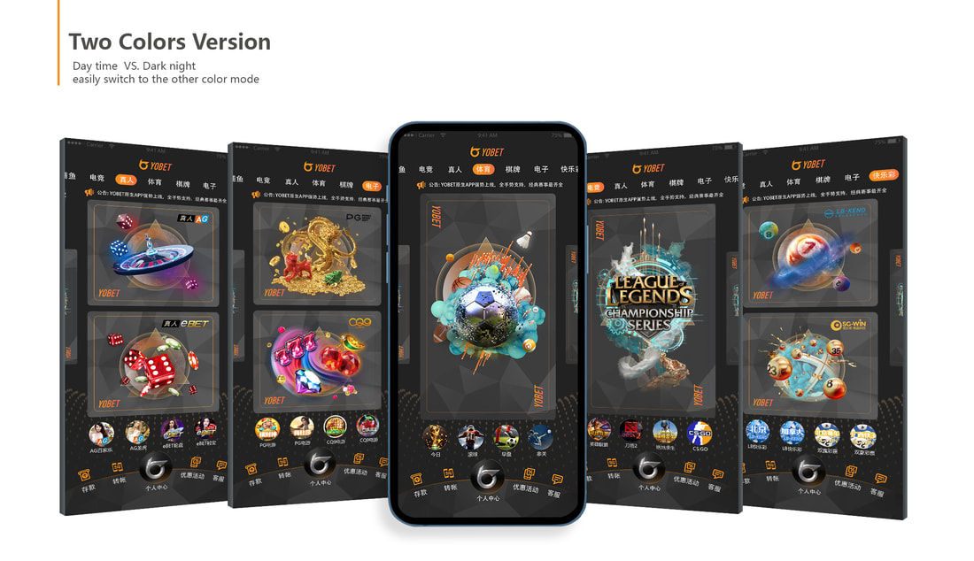
▲Two color versions-- Landing page sample
We chose keep two kinds of color background which are the dark night color version and day light version, to let users freely switch their favorite mode during playing games in order to give a more comfortable reading experience, and it was a very innovative and exciting user experience between those competitors’ apps.
We chose keep two kinds of color background which are the dark night color version and day light version, to let users freely switch their favorite mode during playing games in order to give a more comfortable reading experience, and it was a very innovative and exciting user experience between those competitors’ apps.
|
|
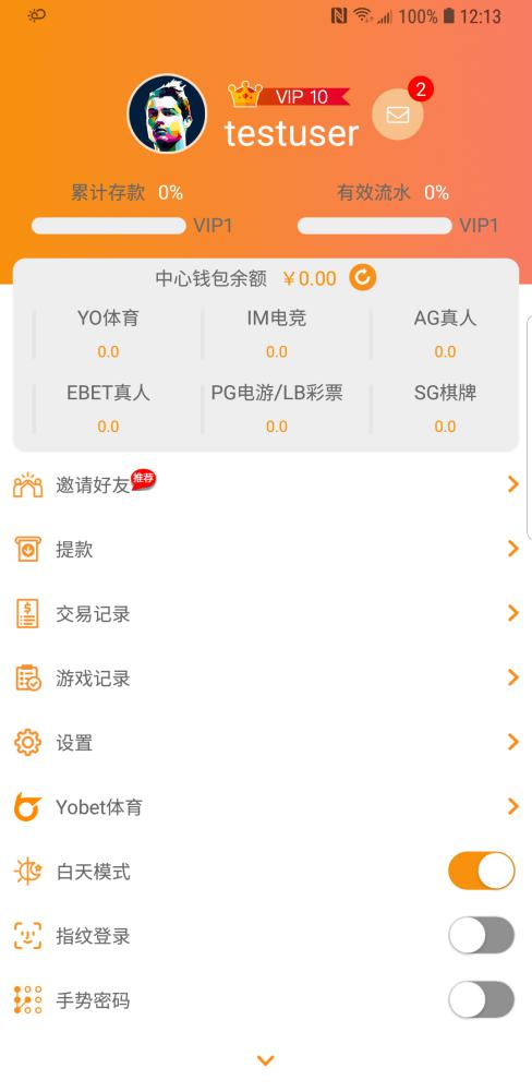
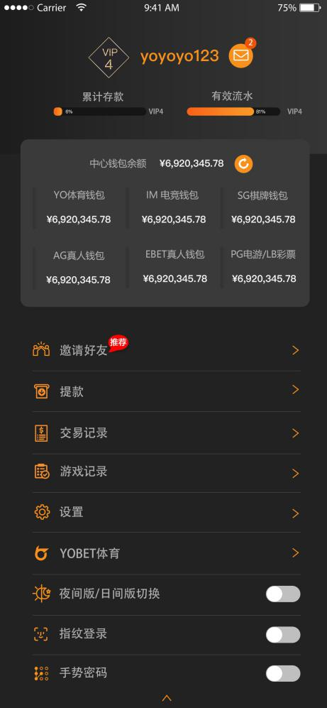
▲Two color versions-- personal account page sample
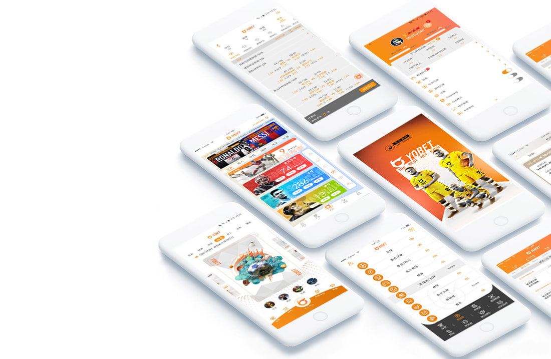
▲FINAL DESIGN: Day light versions APP
▲FINAL DESIGN: Dark night versions APP
REFLECTION:
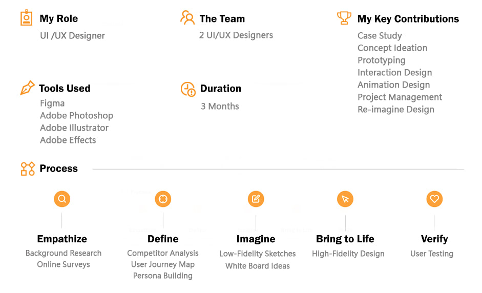
As the UI/UX designer leading a small team of 2-3 designers, I managed the end-to-end design process. This included case studies, user flows, wireframes, mockups, color planning, brand identity design, prototyping, and collaborating with front-end developers to launch the product. The app was published to over 1000 game users in Asia, achieving a significant increase in user engagement and satisfaction.
Key metrics include:
-A 30% increase in user retention rate after the first month
-A 25% reduction in bounce rate due to improved UI/UX
-A 40% increase in user session duration, indicating higher user engagement
-Over 90% positive feedback from users on both the website and app
-A 20% increase in user brand loyalty, reflected in repeat user visits and higher customer lifetime value
We also promoted the product through TV and social media platforms, and continually refined it based on client feedback, resulting in the second and third versions of the app. The project received excellent feedback, and I excelled in prototyping and visual components, adding interactive elements to enhance the user experience.
This project is a source of great pride for me, as I witnessed its evolution and widespread public adoption. The tangible impact on user engagement, satisfaction, and brand loyalty underscores the success of our design efforts.
See more design case study >>

